Experiments with GPT

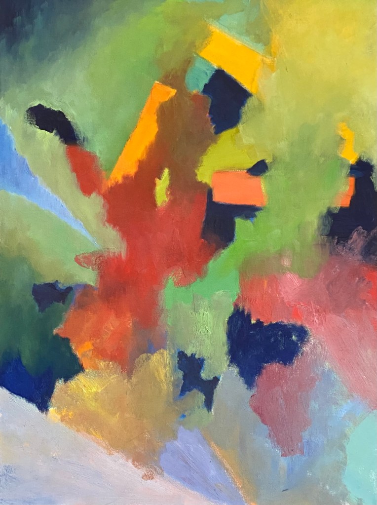
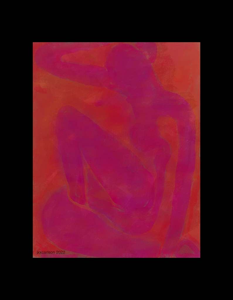
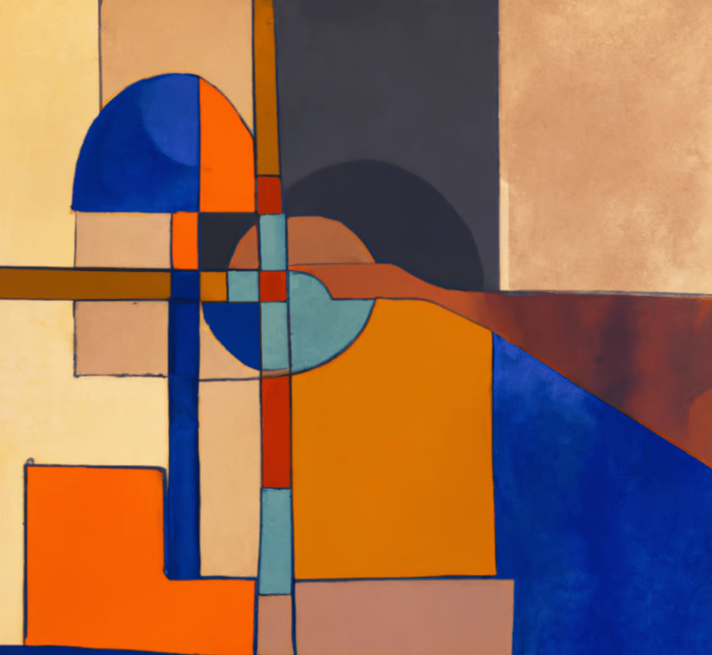
The past few weeks I’ve been drawn to experiment with GPT, asking it to help write or revise poems, songs, and code, talk about physics, etc. Yesterday, I decided to make a little app to make images using GPT. Below is one image, created by asking “make an abstract painting mixing the styles of Braque and Klee; use blues, reds, a little orange and warm grays.”

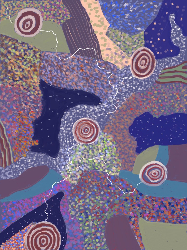
Below is another, generated by asking GPT to “make an abstract painting blending the styles of Braque and Signac. Use mostly pastel colors but some with strong values.”

GPT prompt: .

Writing the app turned out to be surprisingly easy. OpenAI, the company behind ChatGPT, has very good documentation. Browsing it, I found an explanation of how to generate images. Here is the key piece of code, a shell script:

url https://api.openai.com/v1/images/generations \
  -H "Content-Type: application/json" \
  -H "Authorization: Bearer $OPENAI_API_KEY" \
  -d '{
    "prompt": "A cute baby sea otter",
    "n": 2,
    "size": "1024x1024"
  }

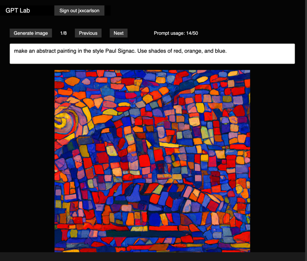
I signed up for an API key, tried out the shell script, then started building the app. Below is a screenshot of the first version, which you can find at gpt-lab.lamdera.app. It is written in Elm, a pure functional language, ursing choonkeat’s Elm library for working with OpenAI’s API.

Because the API keys need to be kept secret, the code is not, alas, open source. In any case, I am planning some significant upgrades in the next week or so, e.g. a way to save generated images that you like. After an initial test period, there will be a paid plan that you can sign up for if you find it is useful. Usage fees will be very, very modest.

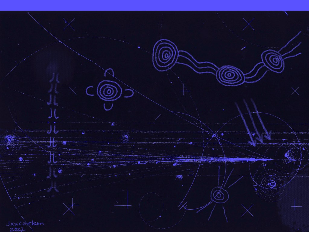
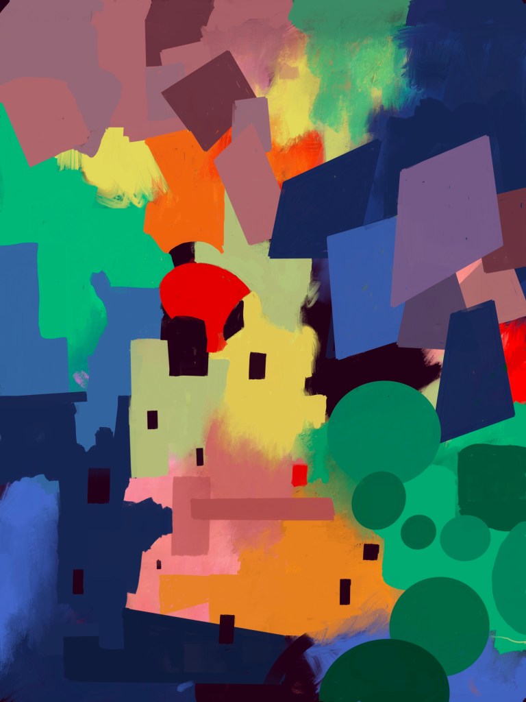
PS. I’ve used the app mostly for generating abstract art. But of course you can prompt it to create any kind of image. Here is one such example:

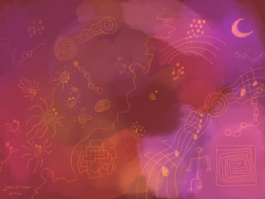
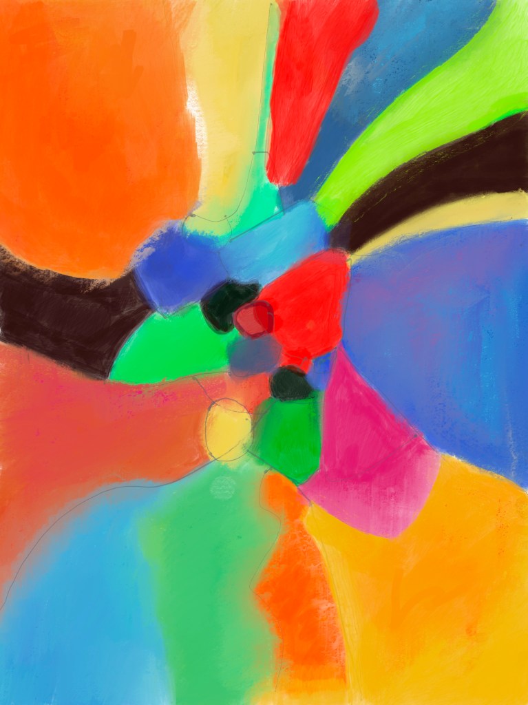
Here is one more image, with a fairly long prompt:

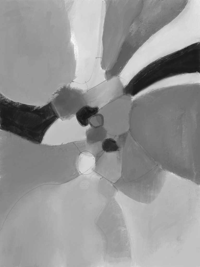
Prompt for the above: An abstract composition with one large shape, two medium-sized shapes, and a few smaller ones. Make it two-dimensional. Add a network of lines. The background should be reminiscent of Australian aboriginal paintings. Keep the colors only partially saturated, with lots of grays and earth tones.

Remark. In its current incarnation, the app generates 10 images per prompt. My experience is that one has to look through at least that many images on average to find one that has satisfying esthetics. The other knob to turn, of course, is tuning the prompt itself, using it to guide GPT in the direction you want to go (and discovering or at least refining that direction as you proceed).

Art Journal 9

The second week of art class at the Art Students League of New York. I’ve signed up for a critique of my paintings tomorrow, Friday February 18. Looking forward to some good advice. I continue to work with oil paints, which I quite like, despite the slow pace of the work: often a day, two days, three days between stages to let the paint dry. I love the way one can blend and work color with oils.

The first painting below started out as something completely different, with large irregular areas in pastel colors. I didn’t like where it was going and so changed course completely, painting a few rectangles, then adding the vertical and horizontal lines. At this point it was still too static, so added some diagonal lines and started to bring out the triangular shapes. By this time, the second session, a structure had emerged, and I continued to work with it. Three or four sessions in all.

Untitled, oil on canvas 24×30 inches

In the painting below, I began with some large irregular areas of color, then began to add rectangles of color. At some point I added the horizontal and vertical lines. Clearly I was using lessons of the previous painting. One point of difference: left areas of white.

Untitled, oil on canvas 18×24

Art Journal 8

The first week of my art class with Peter Bonner at the Art Student League of New York. The class is on-line with student concentrated in the New York area but scattered everywhere. Peter spends the first hour of class discussing paintings — the majority abstract, but some from earlier times. He talks about what makes a painting work — value, rhythm, etc. Very valuable, both for looking at paintings and making one’s own. When paining, I spend a lot of time looking at what I’ve done so far, trying to figure out what is missing, what makes me uncomfortable, etc. Peter’s comments really help with that. He is both analytical and kind. A big range of ages, tending towards senior, with more women than men. Some really great work.

Interaction, Oil on canvas 24×30 inches

Untitled oil on canvas, 18×24 inches

Art Journal (6) Tracings

Tracings

For this study I used the same sgrafitto technique as with #5, but with cool instead of warm colors and combining both Australian aboriginal symbols (meeting place, campsite/waterhole, human and kangaroo tracks, people sitting, spears) with images from a bubble chamber, where one sees tracks coming from the collision of 300 GeV proton in the 30 inch hydrogen bubble chamber at Fermilab (credit: Wikimedia Commons).

Art Journal (4) Matisse Study

Matisse Study

This was a study in using an existing image as a starting point. The goal was to have the figure barely emerge from the background. There are ten layers in this digital piece, all with varying degrees of opacity which I “tuned” by trial and error. Most layers are normal, but some have a non-trivial blending mode, e.g., multiply. A very partial success, but a good experiment and experience.

Art Journal (2) Rhomboidal Rain

January 20, 2022

Rhomboidal Rain

In this exercise I tried for much more value contrast, of which there was not so much in exercise #1. Also: both hard and soft edges, blended and unblended shapes. I think the final blended – unblended ratio is is out of balance. There should be more of the latter. The descending rhombus shapes, then the circles, were a late addition which finally made the composition come to life. (Made this with Procreate; need to try real paint soon).

Today, a big step forward: I signed up for a class at the Art Students League of New York: Bonner-Abstraction. Hope to learn lot.

Art Journal (1) Gravity’s Pull

January 19, 2022

This is the beginning an art journal for 2022. Getting serious for the new year!

Gravity’s Pull

Constructed using Procreate. (1) Sketched a few lines and shapes in blue pen, with a focus of small shapes near the center and larger elongated converging to the focus. (2) worked with color: lay down a first layer, some blending, then worked related colors into the base to make them richer and more varied.